Metrics
Charting a metric with an aggregate select, the metric catalog, and the aggregation-versus-encoding rules that decide whether a chart comes back empty.
Metrics
Pick Metrics in the sidebar, or write a query with from metrics. Unlike
logs and traces, metrics has no plain row view: you either list what
metrics exist, or chart one.
Listing what you have
select * from metrics and select <columns> from metrics are not
projections here; they are the catalog question, "what metrics does this
org have", the same answer up0 metrics ls gives on the terminal (see
From the terminal). The catalog has its own fixed
shape (metric_name, metric_type, series_count) and its own fixed
ordering (busiest first), so a where or order by next to it is rejected
rather than silently ignored:
select * from metrics where service_name = 'checkout'
→ Listing metrics doesn't support a where clause — labels only apply once
  you're charting a metric, e.g. select avg('http.server.duration') from
  metrics where attr:'region' = 'eu-west'.
Charting one metric
Name a function and a metric to switch from the catalog to a chart:
select avg('example.queue.depth') from metrics
select quantile('example.http.duration', '0.95') from metrics
select avg('example.queue.depth') from metrics group by 'route'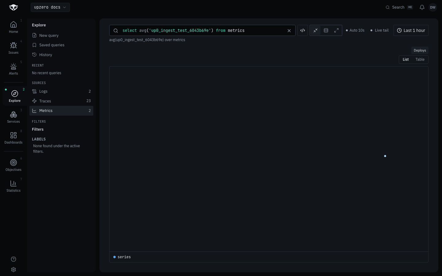
The chart's legend switches between a compact list and a per-series summary
table. group by splits the chart into one series per distinct value of the
named label, up to 10 label keys at once.
Filtering by label
Metrics filter by label, never by a metric-record column: where
accepts only attr:'<label>' = '<value>' predicates (and !=), ANDed
together. There is no or form for a label filter, and no plain-column
predicate at all:
select avg('example.queue.depth') from metrics where attr:'region' = 'eu-west'
select avg('example.queue.depth') from metrics
  where attr:'region' = 'eu-west' and attr:'env' != 'staging'
The aggregation has to match the encoding
metric_type, visible in the catalog and echoed back on every charted
series, is not decoration. It decides which aggregations can return
anything at all:
metric_type | Works with |
|---|---|
gauge, counter | sum, avg, min, max, count, quantile |
histogram, exponential_histogram, summary | quantile only |
sum/avg/min/max/count operate on a raw scalar value, which only
gauges and counters have. A histogram data point is already an aggregate
(bucket counts, not a number), so avg('some.histogram.metric') returns
null in every bucket. That reads as "this metric is broken" when it
actually means "wrong aggregation for this encoding".
For anything histogram-shaped, use quantile, which resolves the storage
shape server-side and works across all four encodings. You do not need to
check the catalog first:
select quantile('example.http.duration', '0.95') from metrics'0.95', quoted, is a fraction in [0, 1], not a percentile.
Two behaviours worth knowing before you read the chart
Counters are not rate-corrected. A counter's value is its raw cumulative
total, so charting one shows growth, not throughput. metric_type on the
series tells you which case you are in.
An empty bucket is null, not 0, except for sum and count, where
zero is a real answer. A null means no data was recorded in that bucket;
rendering it as 0 would assert a measurement that never happened.
For summary metrics, only the quantiles the instrumentation actually
recorded come back. Asking quantile for a fraction it never computed
returns null rather than a value interpolated between two others. upzero
will not invent a number the client never reported.
Bucket width
Bucket width is derived from the time range, targeting roughly 50 buckets across whatever you selected. You control the range, never the width directly.
Why logs and traces cannot be aggregated (yet)
select avg(...) from logs is a parse error, not a compile error. See
Query language for why
the refusal happens as early as it does, and what "yet" means here.